
| Created | 28 March 16 |
| Last Update | 29 March 16 |
| High Resolution | Yes |
| Widget Ready | Yes |
| Compatible Browsers | IE9, IE10, IE11, Firefox, Safari, Opera, Chrome, Edge |
| Software Version | WordPress 4.4.2 |
| ThemeForest Files Included | PHP Files, CSS Files, JS Files, PSD |
| Columns | 2 |
| Documentation | Well Documented |
| Layout | Responsive |
| Tags | article, blog, clean, editorial, magazine, magazine site, modern, news, newspaper |
| Package Tracking Service | Split - Responsive WordPress Magazine Theme TFxReviewed by Fxtheme |
| Rating : | 8.8/10 . |

Magazine theme:
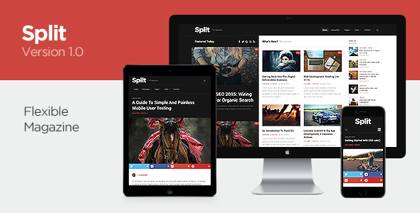
Split is a responsive high resolution magazine, news & blog theme. With a unique split post layout, article images stand out.
Features
- Sticky article title and image – Article title, image and social share links are always visible as you scroll down to read more.
- Related posts & post nav – Motivate your readers to explore more articles on your website with related posts and links to previous and next article.
- Footer ads – Prepared footer widget area for leaderboard ads can be enabled.
- 100% High resolution – Awesome sharpness on retina screens and other high resolution devices. No compromise anywhere.
- Ultra responsive – This theme will scale down beautifully from a full hd resolution down to a low resolution mobile phone.
- Post formats – Easily show video, audio, image and gallery sliders with the most used post formats available.
- Extensive styling options – Set any of unlimited accent colors for the theme and other specified areas in seconds.
- Unlimited widget areas – There is no limit to how many widget sidebars you can create. Each widget area can be assigned to a unique page, post or standard WP sections.
- Almost zero images – With Font Awesome, CSS and a modern flat look this theme manages to load only a few images total for the whole layout, depending on layout choice.
- Set the website max-width – You choose how wide you want your website to be via the admin panel. With a neat numeric slider, it’s one click away.
- 0-4 Footer widget columns – Use anything from no footer widgets all the way up to 4 columns. A personal favourite is 3 columns for good space on all devices.
- Font selection – Choose from a list of some good-looking fonts supplied via Google Fonts. Latin Extended and Cyrillic options included.
- Social links – Easily add your own social links to your header and footer. Use any of 605 icons. Set a unique color for each if you want.
- Integrated share counts – Sharrre is inlcuded which gives you high-res share buttons and counts for each article. Not a fan of social media? Just disable them.
- Flexible layout options – Set sidebars on any post or page. You can also specify for home, single, archive, category, search and error 404 pages.
- Backend theme options – Great customization ability directly from the theme options panel without having to touch any code at all.
- Good SEO – The markup is search engine optimized to allow the best possible result for your website.
- Straightforward code – A WordPress theme code structure that is easy to work with. No layer upon layer with bloated code.
- Custom built widgets – Includes widgets to display responsive video, tabbed content, post lists and other neat features.
- Custom logo upload – Upload your own custom logo with a few simple clicks. No logo yet? Use the standard plain-text option.
- Custom page templates – Page templates for things such as a childpage menus are included. The layout options are many.
- Cross-browser support – Compatible with the latest versions of modern browsers – Firefox, Chrome, Safari, Opera and IE8 or 9+.
- Localisation support – Translate into any language you wish using the included .po/.mo files. Everything you need to get started
- OptionTree framework – Fully integrated OptionTree, a fantastic theme options framework that is easy to work with. Created by Derek Herman.
- Full child theme support – The theme has been built with child themes in mind. All functions and files are pluggable and easy to work with.
Related Posts